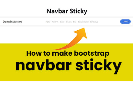
How to make bootstrap navbar sticky
How to make bootstrap navbar sticky:- Creating a sticky Bootstrap navbar involves ensuring that the navigation menu stays fixed at the top of the webpage as users scroll down. This functionality is particularly useful for enhancing user experience by providing constant access to navigation links without requiring users to scroll back to the top of the page.
Setting Up a Bootstrap Navbar
Bootstrap offers a straightforward way to create responsive and visually appealing navigation bars. To start, you’ll need to set up the basic HTML structure for your navbar. Here’s a simple example:
<nav class="navbar navbar-expand-lg navbar-light bg-light">
  <div class="container">
    <a class="navbar-brand" href="#">Your Logo</a>
    <button class="navbar-toggler" type="button" data-bs-toggle="collapse" data-bs-target="#navbarNav" aria-controls="navbarNav" aria-expanded="false" aria-label="Toggle navigation">
      <span class="navbar-toggler-icon"></span>
    </button>
    <div class="collapse navbar-collapse" id="navbarNav">
      <ul class="navbar-nav">
        <li class="nav-item">
          <a class="nav-link active" aria-current="page" href="#">Home</a>
        </li>
        <li class="nav-item">
          <a class="nav-link" href="#">About</a>
        </li>
        <li class="nav-item">
          <a class="nav-link" href="#">Services</a>
        </li>
        <li class="nav-item">
          <a class="nav-link" href="#">Contact</a>
        </li>
      </ul>
    </div>
  </div>
</nav>
In this example:
- The
navbarclass sets the basic structure of the navigation bar. navbar-expand-lgensures the navbar expands to occupy the full width on large screens.bg-lightand other classes provide styling options.
Making the Navbar Sticky
To make the navbar sticky, you need to add a bit of custom CSS. Here’s how you can achieve that:
/* Custom CSS for sticky navbar */
.sticky-top {
  position: sticky;
  top: 0;
  z-index: 1000; /* Adjust z-index as needed */
}
Apply the sticky-top class to your <nav> element like this:
<nav class="navbar navbar-expand-lg navbar-light bg-light sticky-top">
  <!-- Navbar content as before -->
</nav>
Testing and Adjustments
After applying the sticky-top class, test your navbar by scrolling through the webpage. The navbar should remain fixed at the top of the viewport as you scroll down. You may need to adjust the z-index value in your CSS if the navbar overlaps with other elements on the page.
Responsive Design Considerations
Bootstrap handles responsiveness by default, but ensure your navbar collapses correctly on smaller screens using Bootstrap’s responsive utility classes like navbar-toggler.
Additional Tips
- Customization: Customize the navbar further by adding your own branding, colors, or additional navigation items.
- Browser Compatibility: Test your sticky navbar across different browsers to ensure consistent behavior.
- Performance: Keep your navbar lightweight by minimizing unnecessary JavaScript and CSS.
Conclusion
Implementing a sticky Bootstrap navbar improves usability by keeping essential navigation links readily accessible as users explore your website. By following these steps and considering the tips provided, you can effectively integrate and customize a sticky navbar that enhances the functionality and aesthetics of your web project.